-He was born in 1867 in Richland Center, Wisconsin and died in 1959 in Phoenix, Arizona. The distinct geometrical clarity in his architecture was inspired from a series of educational blocks his mother had purchased for him when he was a child.
Due to financial issues, he never attended high school, and was granted admission to Wisconsin University in 1885 as a special student. He also took 2 architectural evening classes.
Falling-water in Pennsylvania is one of his best designs that is well known all around the world. This organic design is in harmony with nature. In certain aspects, it has a lot of elements from the International Style, but it also features a lot of Wright's typical touches, such as natural style. This housse very much goes with ans contrasts into its surroundings. It opened a new chapter in American architecture and it understood to be one of the greatest critiques of the modern design.
The unusual house draws thousands of visitors yearly. They are very intrigued with its exeptional picturesque setting and reputation. A true masterpiece.
Another interesting design is the Adams' House in Chicago, Illinois. The four square style house was designed between 1900 and 1901. The facade of the first floor exterior is made of wood. Some characteristics of this house are; The house has a low pitched roof and large porch. It also has rectangular dormers and double hung windows, which is unusual because Wright used to hate that style of windows. He used to compare them with guillotines. It was made of inexpensive nature, and later became a favorite mall city lots.
(2012). /. Available: http://www.franklloydwright.org/. Last accessed 27th january 2014
Contextual and Cultural Referencing in Art and Design (unit 3)
Monday, 27 January 2014
Essay
Marcel Breuer and Claes Oldenburg
Marcel Breuer (1902-1981)
was active during the Bauhaus movement, and was an architect and also a
furniture designer.
On the other hand, Claes Oldenburg (1929-present) was
active in the radical and pop design movement years later, and was a sculptor
and artist.
Although their difference in times and style, both artists had inspired themselves from random objects that one sees or uses every day. Breuer had first inspired himself from his bicycle’s handle bars. He developed his ideas and studies to produce his tubular steel furniture. Claes also got his inspiration from everyday objects, when he used to go walking downtown and see all the luxury cars and grand pianos in showrooms. He concluded that if people liked them, they would also like seeing everyday objects that you wouldn’t normally see made into a sculptor with a colossal size.
marcel breuer's bent tubular steel chair |
Claes Oldenburg's Giant Fag-ends |
Breuer’s designs didn’t have
much colour; they mainly always consisted of black and the silver steel. Although
his furniture was comfortable, he always used hard materials. Oldenburg’s sculptors
however always had bright, vivid colours, and he liked stuffing his pieces with
foam, because he thought people would like to feel and touch something soft
rather than hard when they interacted with them in exhibitions/ in the open.
marcel Breuer armchair |
oldenburg's giant ice-bag |
The Bauhaus
movement was all about functionalism, aesthetics and minimalist design, and that
is exactly how Breuer designed his furniture and designs. The anti-design
movement however wanted to go against all ‘’design rules’’ and ‘’mock’’
previous movements.
Marcel Breuer’s
work was inspired from Cubism, Constructivism and also De Stijl. Therefore, his
furniture had function, complexity, intersecting plane composition and rectilinear
design. His designs are one of the most
endurable furniture ever made.
Claes Oldenburg was against all that, i.e. all the ideas Breuer followed.
He was inspired from Pop-Design and Surrealism. His simple designs challenged the
human body with their extreme-scale, which also infused humor between the ‘’normal’’ crowd. Unlike Breuer’s designs, his sculptures had a kitsch-feel and look to them.
One of the few
things these well-known designers have in common is the fact that they both
took a chance and decided to experiment with a new technique, something that
would change the history of design.
Marcel had this idea in his
head that he could combine old furniture with new materials and an aesthetically-pleasing
piece would be created. That is when he created the Wassily chair, 1925. He
combined and ‘’old’’ material, which at first was iron yam but then he changed
to leather, with a ‘’new technique’’’ which was the bent tubular steel. He very
much realized his visions because this timeless chair became was one of the
most popular mass-produced chairs ever.
Alessandro mendini wassily chair re-design |
Breuer's wassily chair
Claes wanted to be different from the rest of
the crowd, and wanted something new for people to look and appreciate. That is
when he created an alternate form of sculpture by challenging the rigid and
austere composition of the sculpture we are used to. There are multiple
examples that show this but one of his most-popular was the giant BLT (bacon,
lettuce and tomato) sandwich that was realized in 1963. His idea was a huge
success because a few years later, he inspired other artist at the other side
of the world, here in Europe.
|
pratone seat by gruppo strum |
Giant BLT sandwish Oldenburg |
Robert F.Gatje . (/). a brief biographical note . Available: http://www.marcelbreuer.org/Biography.html. Last accessed 23rd january 2014.
/. (2011). Giant Ice Bag. Available: http://worldvisitguide.com/oeuvre/O0016516.html. Last accessed 27th january 2014.
not mentioned. (2014). Claes Oldenburg GIANT BLT (BACON, LETTUCE, AND TOMATO SANDWICH) 1963. Available: http://whitney.org/Collection/ClaesOldenburg/2002255as. Last accessed 27th january 2014.
Ben. (2006-2011). pratone chair. Available: http://www.likecool.com/Pratone_Chair--Seating--Home.html. Last accessed 27th january 2014.
Saturday, 25 January 2014
Ettore Sottsass (chart designer5)
He was born in 1917 in Innsbruck, Austria, and died in 2007 in Milan Italy. He was an Italian architect and product designer of the late 20th century. Attended Turin University. Sottsass was the founder of the Memphis group in the early 1960's.
He designed some iconic electronic products for Olivetti, recognizable glass and ceramics.
After the war, electronics was a huge buisness. He changed the cold, scary machines into friendly, fun and aesthetically pleasing
Interesting video about Ettore Sottsass:
He designed some iconic electronic products for Olivetti, recognizable glass and ceramics.
After the war, electronics was a huge buisness. He changed the cold, scary machines into friendly, fun and aesthetically pleasing
Interesting video about Ettore Sottsass:
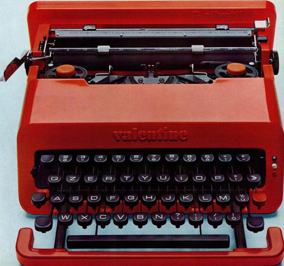
His blood-red "Valentine" typewriter manufactured in 1969 was a fun, bright and playful design inspired from the Pop-Design movement. It was too expensive to ever mass-produce, but became a classic. It also focused a lot on appearance and had several functional limitations.
The Carlton bookcase and room-divider designed in 1981 os one of the most iconic pieces from the Memphis Group. It was made out of wood and laminated plastic. Its depth-ness laminated materials are all Memphis trademarks. It has traditional wall shelving, and the vertical and horizontal structure is a multipurpose, dynamic object, and like a sculpture it can stand on its own. It was inspired from Sottsass' time in India. Colourful with meaningful symbolism, just like Indian culture.
The cubistand geometric order of space and also the bright colours remind me of Rietveld's Red and Blue chair, 1918.
Rietveld's Red&Blue chair, 1918.
The Mandarin Chair was designed in 1986. He was inspired by the Chinese Ming dynasty. He initially chose primary colours, green, grey and black combined with different variations of colour. Sadly, these vintage chairs are not in production anymore. The wood armrests are vapor-bent and goes around the entire chair.
Deyan Sudjic. (2008). ettore sottsass architect and product designer.Available: http://designmuseum.org/design/ettore-sottsass. Last accessed 25th january 2014.
Friday, 24 January 2014
Charles & Ray Eames (Chart Designers4)
Charles Eames; 1907-1978 Ray Eames; 1912-1988
At the age of 14, Charled Eames worked at Laclede Steel Company, where he learnt engineering, drawing and architecture. He attended Washington University where he was dropped out because of hi "too modern" views. He met his wife Ray at Cranbook, where they both were working. Ray was an artist, designer and also a film maker. In 1933, she had graduated from Bennett Collage and was a founder of American Abstract Artists.
The classic LCM chair was designed between 1945 and 1946. The seat and back panel were made out of molded plywood, and the legs chromium plating finish rods. For some flexibility and also to join all the chair's elements, Eames used rubber mouths. The lounge chair was a low cost item and was quickly mass produced everywhere.
670 chair and 671 ottoman were designed in 1956. It was the best retail success Eames ever made. It's concept was to be warm and comfortable to be frequently used. It was fulled with foam rubber and filled button upholstery. The seat and back were molded plywood shells of Rosewood timber veneer. Unlike the swiveling seat, the base of the chair had a fixed, 4 cast aluminium base.
This chair very much reminds me of Le Corbusier's chaise lounge chair, which also had a metal frame and had foam filled leather cushioning and same function and concept.
Le Corbusier's Chaise Lounge Chair
An interesting video about the making of the 670 lounge chair: http://www.youtube.com/watch?v=tbF8QYU4LSA
The Eames house was built in 1949 at Pacific Palisades California. The modern house was richly decorated with art and architectural projects, books and artifacts. At first, they were not designing it for themselves, but when it was done they fell in love with it and the meadows, and ended up living there. The target audience they were designing it for was a married couple with no children.
The outside of this house reminds me a lot of the Schroder house from the De Stijl movement. Both their exteriors have the boxy, cubist idea, and they also both have the primary colours painted on the outside.
SCHRODER HOUSE EXTERIOR |
FOREIGN EAMES |
(2014). Charles & Ray. Available: http://eamesoffice.com/charles-and-ray/. Last accessed 24th january 2014.
Thursday, 23 January 2014
Marcel Breuer (Chart Designer3)
He was born in 1902 in Pecs, Hungary, and died in 1981. He was a modern architect and furniture designer.
He left his hometown at 18. He wanted artistic training and ended up being one of the first and youngest students of the Bauhaus. Breuer was one of the most successful and well known Bauhaus (and later tutor) of all time.
There, he was put head of the carpentry workshop by his tutor Walter Grupious, after he recognized his significant talent.
He was also known for his invention of tubular steel furniture,inspired from bicycle handle-bar.
The Cesca Chair, named after his daughter Cheska, was one of the many most-known tubular steel chairs. Breuer believed that combining old furniture with new materials, one could create an aesthetically pleasing piece. He backed up his theory by experimenting further with tubular steel.
A single piece of tubing was used to form the frame; sled base and back support. Bent timber frames were used to construct the seat and back. They were filled with natural caning and screwed in the tubular metal frame.
This chair will always be remembered as a huge, influential part of modern furniture history due to the new form the cantilever principle created.
The Wassily chair designed in 1925 is Marcel's best known chair. This timeless modern piece was named after Breuer's friend, painter Wassily Kandinsky.
He was influenced by the Bauhaus and Cubism, interesting plane composition of De Stijl and complexity were from Constructivism.
He came up with the idea of bent tubular steel while studying the handle-bars of his bicycle. A local plumber had helped him weld the frame together and he achieved what he wanted.
His designs were first influenced by Rietveld's Zig-Zag and Red and Blue Chair.
Initially, the chair had a nickle plate finish, but then he changed it to chromium. The fabric was initially iron yam and then he changed it to leather, and has become one of the most endurable tubular steel chairs ever mass-produced.
Another revolutionary artist made in the product design history.
Robert F.Gatje . (/). a brief biographical note . Available: http://www.marcelbreuer.org/Biography.html. Last accessed 23rd january 2014.
Wednesday, 22 January 2014
Gerrit Rietveld (Chart Designer2)
He was born in 1885 and died in 1965 in Wrecht, Netherlands. This Dutch architect and furniture designer was on of the principal members of the Dutch movement De Stijl (the style).
In 1904 to 1908, he attended evening classes for drawing and also the study of Ornamentation in Utrecht.
In 1906 he attended classes by architect PJC Klaarhamer. This tutor was of great importance to Rietveld's future, because through these classes he learnt about recent national and international trends in applied arts and also architecture.
-The Red and Blue chair was initially developed without its vivid colours in 1918. The coloured version was designed in 1923. Every piece of this chair is either shaped as a square or a rectangle. This is highlighted by the use of a bright yellow in every piece's end.
The spine of the chair was produced in red and all its "limbs" are connected to each other; the blue sloping back seat and black arms and legs.
Rietveld chose aesthetics over functionalism. The design's raw state that stripped back to basic structural form was genius and looked good, however it was not comfortable at all.
His geometric ordering of spcace was influenced by Piet Mondarin's cubist work, and the use of rectilinear design from Frank Lloyd Wright.
When I look at this chair, I remember Marcel Breuer's Lattenstuhl, designed in 1926. It has the same cubist wand rectilinear design.
Marcel Breuer's Lattenstuhl, 1926
Another recognized piece of Rietveld is the Zig Zag chair designed in 1934. It's made up of only 4 elements. The chair is joined with dovetail joints, brass nuts and bolts through the corner block that are in a triangular form. It has an extremely complex design and shape. On the other hand, its visual effect is pretty simple and occupies little space. It fits in the modernist and De Stijl design principles.
Gerrit Rietveld was a revolutionist, and one of the most important designers and architects of the 20th century.
Gerrit Rietveld Revolution of Spave.Available: http://www.design-museum.de/en/exhibitions/detailseiten/detailseiten/gerrit-rietveld.html. Last accessed 22nd january 2014.
Lattenstuhl. Available: http://www.architonic.com/dcsht/lattenstuhl-model-ti-1a-phillips-de-pury-company/4104512. Last accessed 22nd january 2014.
Tuesday, 21 January 2014
Le Corbusier (Chart Designer1)
He was born in Switzerland in 1887, and moved to Paris in 1917. He was the son of both famous artist and musician. At age 13, he left primary school to attend Arts Decoratifs at La Chaux-de-Fonds. There he learnt enameling and engraving watch faces. He made part of the Modern movement.
ARCHITECTURE
A tutor at his school insisted he takes architecture and arranged for him to work on local projects. He designed his first house in 1907 at the age of 20. One of his best works was Villa Savoye 1928-1931
Villa Savoye; 1928-1931
In 1921 he returned to his old school to teach. He designed villas and began to theorize on modern techniques, like reinforcing concrete as a structural frame.
He succeeded in re-building affordable houses in cities that were bombed during World War 1 by this new technique of his.
Interesting characteristics in nearly every structural design Corbusier designed were
-Open space
-Eliminating obstructive pole support
PRODUCT DESIGN
His most famous designs were the Chaise Lounge Chair and the Grand comfort, both designed in between 1928 and 1930.
Both chrome plated with tubular steel and canvas cushions filled with PU foam. His famous chairs remind me alot of Marcel Breuer's Wassily Chair 1926, bent tubular steel and canvas were also used.
Marcel Breuer's bent tubular steel and canvas Wassily Chair.
not mentioned. (2014). LE CORBUSIER. Available: http://www.moma.org/collection/browse_results.php?criteria=O%3AAD%3AE%3A3426&page_number=5&template_id=1&sort_order=1. Last accessed 21st january 2014.
Marijke Küper. (2014). about the artist. Available: http://www.moma.org/collection/artist.php?artist_id=4922. Last accessed 21st january 2014. |
Subscribe to:
Posts (Atom)